Interactive Demo
GWI sells access to global consumer survey data, but prospects couldn’t see any of it until they booked a demo. I led design of the Interactive Demo: an ungated, mobile-friendly way to explore the data first.
Role
Sole Senior Product Designer on this project, leading the E2E design process, collaborating with the PM and Engineering team.
I was responsible for gathering requirements, conducting user research, facilitating ideation workshops, and creating key design deliverables.
Tools & Platform
My primary tool was Figma, used for design, prototyping, and Figjam for running ideation workshops.
Mixpanel, Hubspot and Hotjar was used to gather analytics.
The project focused on developing a responsive web application.
Project Length
This project lasted 2 months from brief, research, ideation, wireframes, visual design and prototypes, with constant engagement with our stakeholders for the MVP.
Another 6 months for post MVP features.
Background
GWI is a market research company that conducts large global surveys, providing customers access to the data through a licenced platform.
Problem
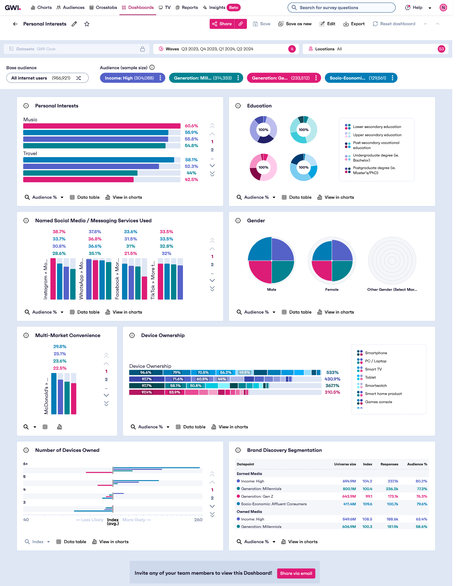
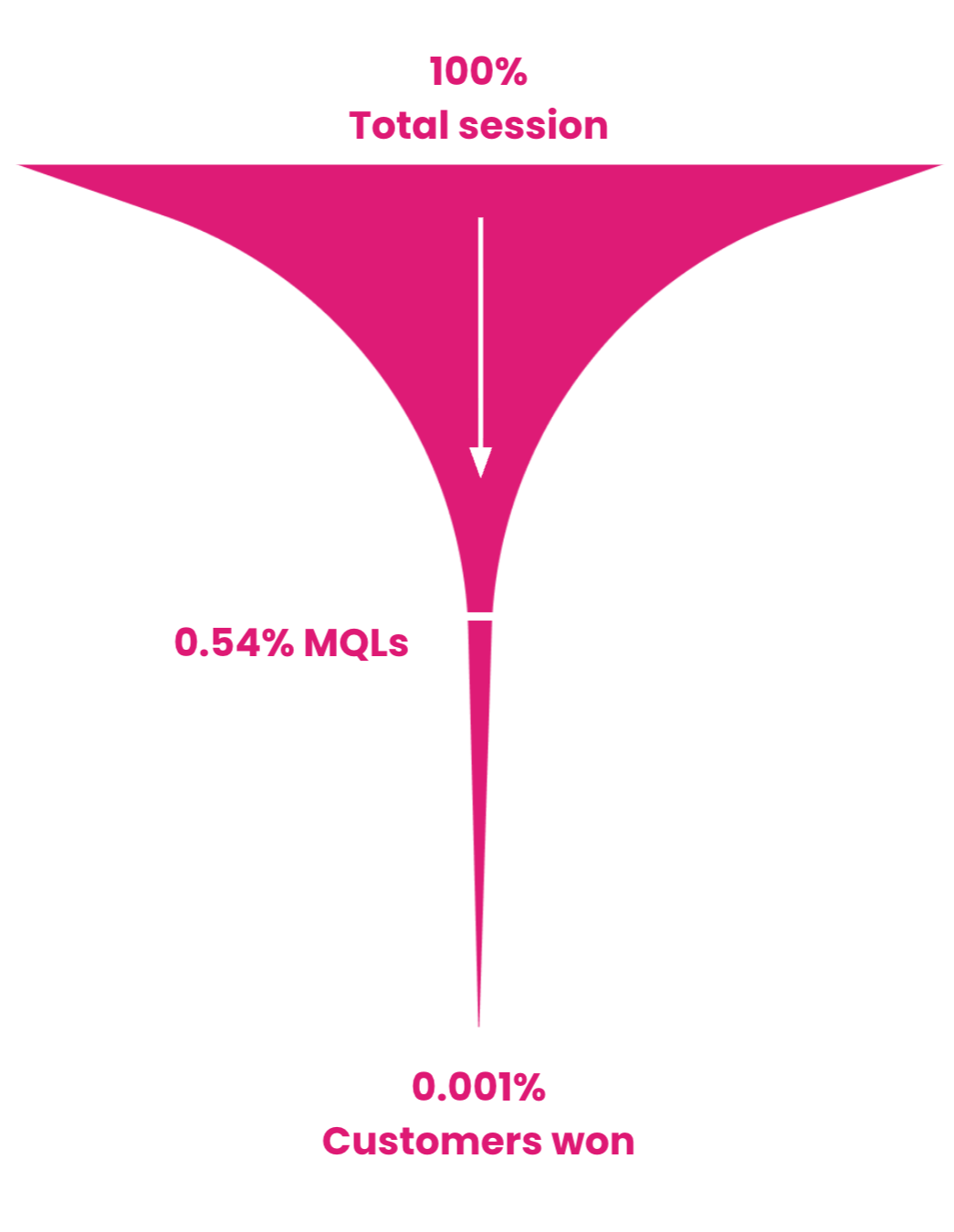
GWI runs large global surveys and licenses the data through a platform. Our marketing funnel converted only 0.54% of sessions to marketing qualified leads (MQLs), against an industry standard of around 2%.
Left: the funnel.
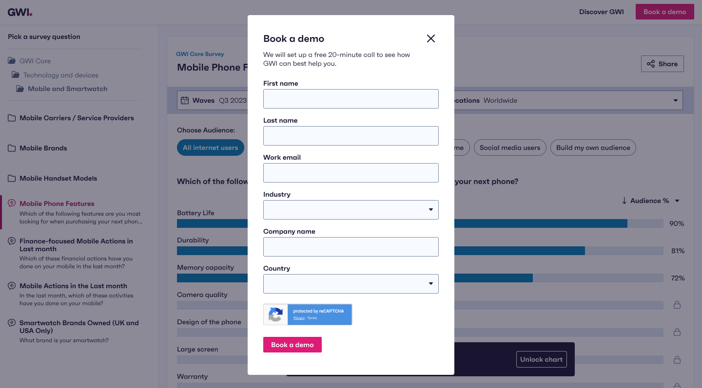
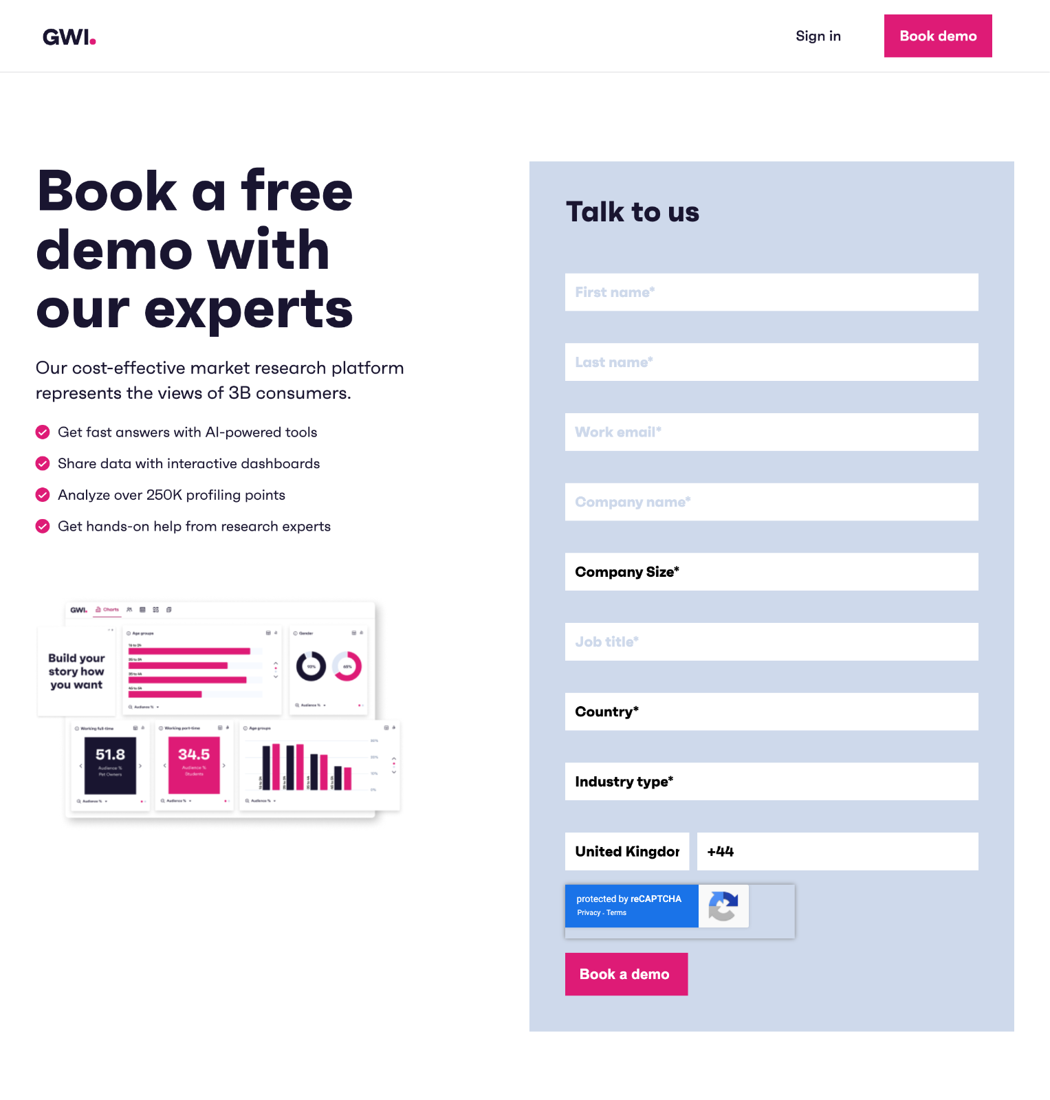
Right: the only way to see the product was this form.
Hypothesis
By creating a free experience of the GWI Platform, potential buyers can experience the value of the Product earlier in the sales journey, leading to an increase in demos booked.
My role
Research
Gathered stakeholder requirements, analysed Mixpanel, Hotjar and HubSpot data, ran a competitive analysis and 20 user interviews across two rounds.
Facilitation
Led the ideation workshop, the solution scoring session and the post-launch “what’s next” workshop with my squad.
Design
Took the work from sketches to responsive wireframes, visual design and prototypes. Extended the design system with new components, built with accessibility in mind.
What we learnt
The insight: a prospect’s first question is whether GWI has data relevant to them. Show that early and demos should follow.
Stakeholders
An accurate representation of the platform that is easy to use and shows depth and speed to insight
Launch within 2 months to affect the financial year
Ungated and discoverable, without giving too much away
Competitors
Few offer a free version, which is a strategic opportunity
Free experiences were limited in function or time-based trials
Locked features were always shown, with frequent upsells
Our own data
Charts is the most-used app among trial customers for its simplicity
Data pages on the website get 3x the traffic of the Platform page
Hotjar recordings show visitors browsing the data taxonomy
Interviews, round one
10 people who had never heard of GWI, from companies of 25 to 330,000 employees
They want to browse data for free before speaking to anyone
The marketing site felt overwhelming and hid what we actually offer
“I like to check out a sample of the data for free to see if it would be useful for me. But your website feels a bit overwhelming. It’d be helpful to have a sample of the data right here.”
-P3, Head of Insights
Choosing the solution
From a workshop of ideas to one bet
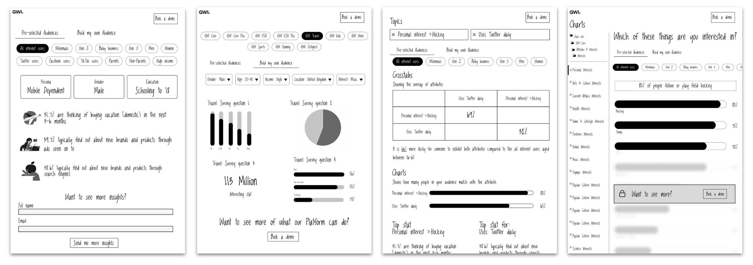
I led an ideation workshop with engineers and product managers. The PM, the Engineering Manager and I evaluated each idea against the research and narrowed them to four concepts, which I sketched in low fidelity to compare ideas quickly.
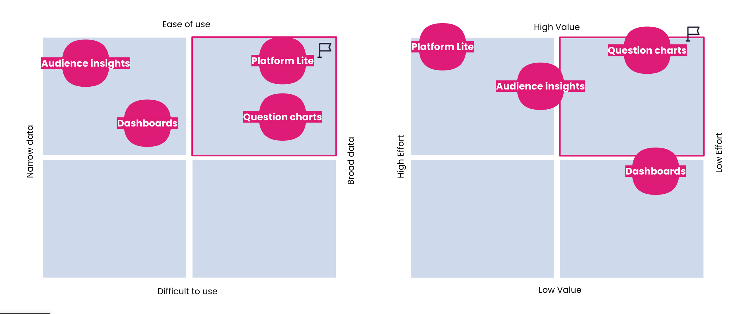
My squad and I scored the concepts on ease of use against breadth of data, and on value against effort. Question charts won: a bar chart for each survey question, with the full taxonomy to browse. Platform Lite offered similar breadth but at much higher effort, which our 2-month window couldn’t afford.
The key design decision
The tension was value versus intrigue. Too little and the demo is pointless; too much and nobody needs sales. I used Mixpanel usage data from the real Charts app to decide which audiences, locations, time periods and metrics to open up, and borrowed the competitor pattern of showing locked features rather than hiding them.
Open
The full data taxonomy, a set of pre-selected audiences, the top three results per chart, and one metric.
Visible but locked
Remaining results, other metrics, other locations and “Build my own audience”, each with a lock icon.
Always present
A clear call to action to book a demo for the full experience.
Designing it
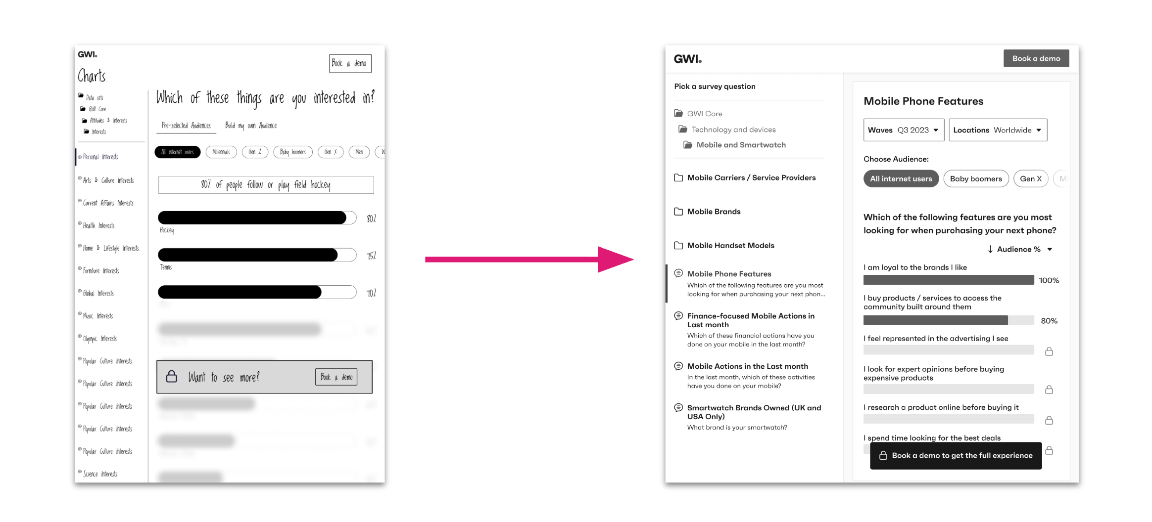
Sketches to Wireframes
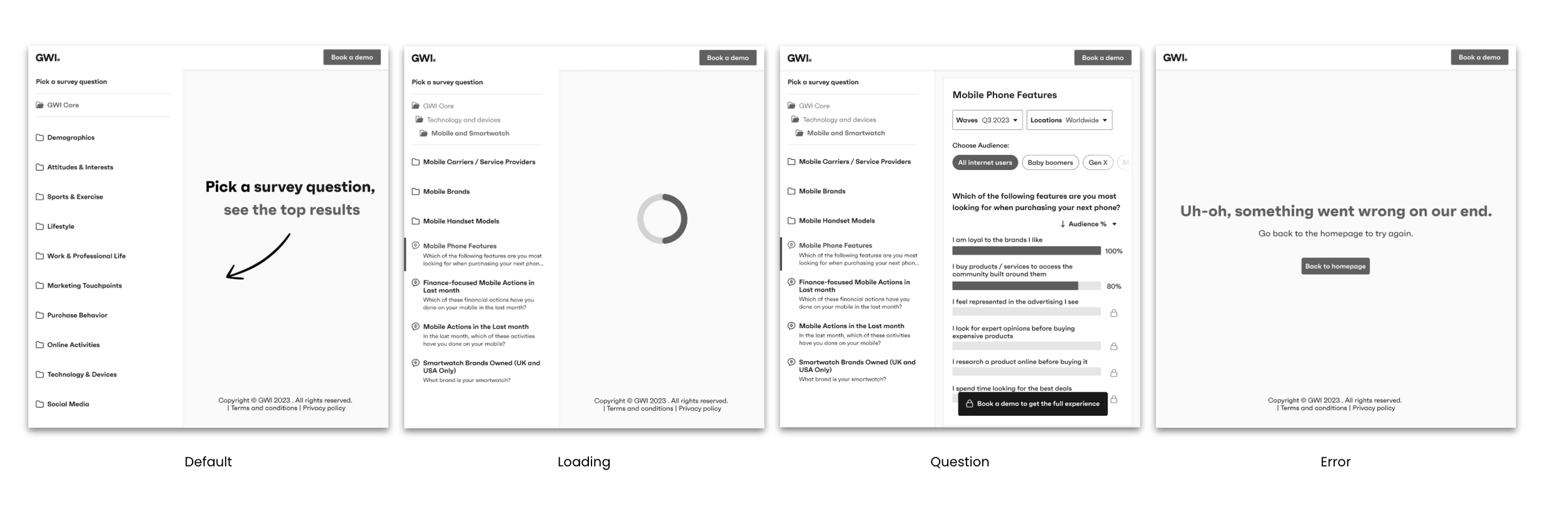
States
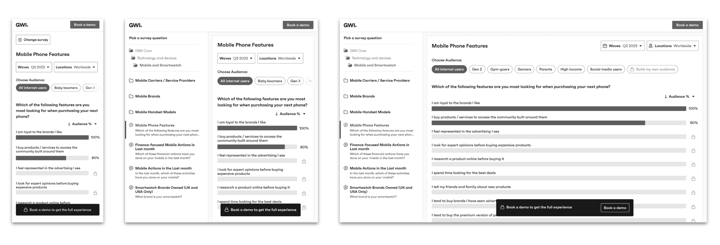
Responsiveness
The solution
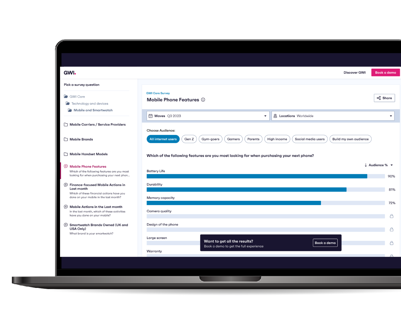
The Interactive Demo MVP
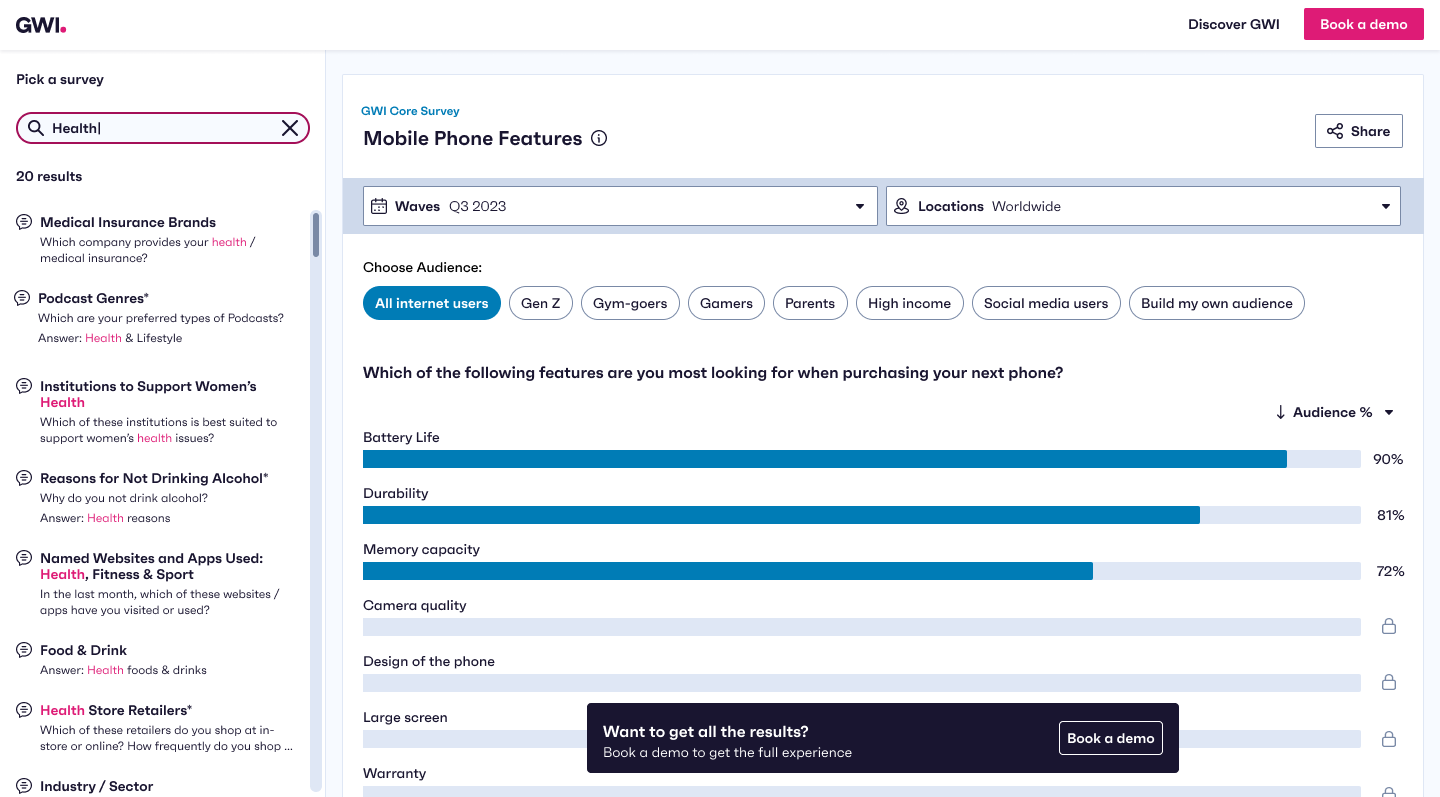
Ungated, accessible and intuitive, with just enough friction to encourage a demo booking. Select a feature to see how it works.
Browse all our data - Full taxonomy in the side panel
Browse all our data - Full taxonomy in the side panel
One metric - Audience % only
Top datapoints - Top three results are open
Global data, latest wave - Other locations are locked
Clear CTA - Book a demo, always in reach
Validating it
Before launch I interviewed 10 more people who had never heard of GWI, across FMCG, gaming, financial services and tech in the UK and USA. We made tweaks, soft launched, then did a bigger launch a few weeks later.
All of them
said the demo made them curious to book a demo and find out more.
9 of 10
found it easy to use. Several called it the best part of the website.
Gap found
Most didn’t understand where the data came from, which fed our backlog.
“I’d be more inclined to book a demo because there is enough free data here to capture my attention.”
- P3, Director of InsightsResults
MQL measure after 6 months
Before: 0.54%
Target: 2%
After: 2.4%
650+
demos booked
30k
unique page views
92%
WCAG 2.1 conformance: 26 of 30 level A and 20 of 20 level AA
1st
mobile-friendly app on GWI’s platform. The CEO used it to demo at Cannes.
After the MVP
A workshop with my dev team shaped what came next
Search
Lets people find a relevant question by keyword instead of digging through the taxonomy.
+4% journey completions · 50% faster to a chart
Optimised demo form
A shorter form in a modal, so booking happens without leaving the chart.
+6% demo requests
Unlocking charts
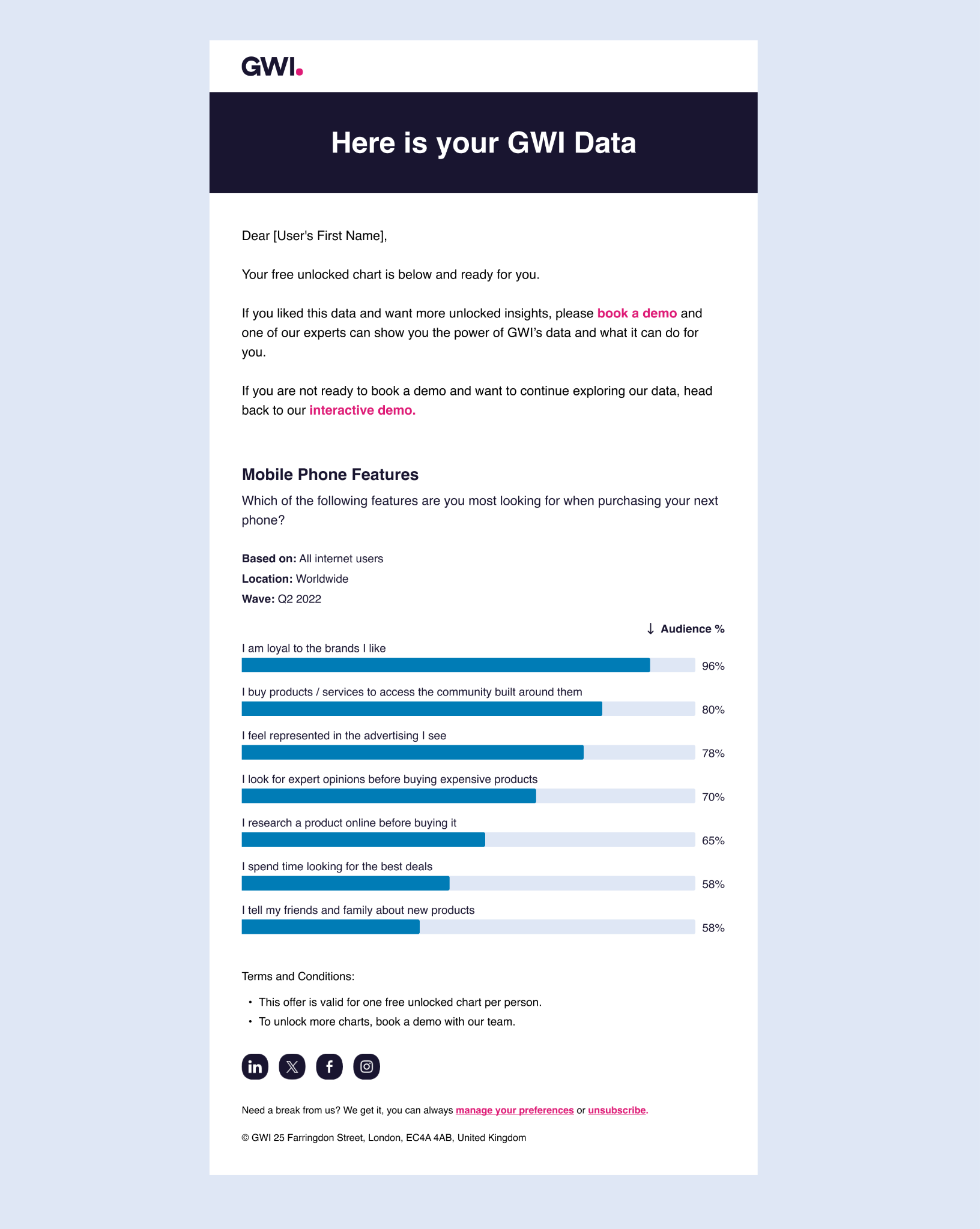
People can unlock one full chart by email, which gives them the data and gives sales a lead.
200+ charts downloaded as leads